数据挖掘学习笔记之matplotlib
数据挖掘学习笔记之matplotlib环境安装工具包版本安装命令折线图环境安装工具包matplotlib 画图numpy 高效运算工具pandas 数据处理工具TA-Lib 股票技术分析指标库tables 读取hdf5类型文件jupyter 数据分析与展示的平台版本matplotlib2.2.2numpy1.14.2pandas0.20.3TA-Lib0.4.16tables3.4.2jupyte
数据挖掘学习笔记之matplotlib
环境安装
工具包
matplotlib 画图
numpy 高效运算工具
pandas 数据处理工具
TA-Lib 股票技术分析指标库
tables 读取hdf5类型文件
jupyter 数据分析与展示的平台
版本
matplotlib2.2.2
numpy1.14.2
pandas0.20.3
TA-Lib0.4.16
tables3.4.2
jupyter1.0.0
安装命令
pip install matplotlib2.2.2
pip install numpy1.14.2
pip install pandas0.20.3
pip install TA-Lib0.4.16
pip install tables3.4.2
pip install jupyter1.0.0
如果TA-Lib在win系统上无法下载,可以到下面的地址去下载 https://www.lfd.uci.edu/~gohlke/pythonlibs/#ta-lib
折线图plot
保存结果图片
import matplotlib.pyplot as plt
# 展现一周的天气,比如从星一到星期日的天气温度如下
# 1、创建画布
plt.figure()
# 2、绘制图像
plt.plot([1,2,3,4,5,6,7],[17,22,18,15,24,22,17])
# 保存图片
plt.savefig("test1007.png")
# 3、显示图像
plt.show()
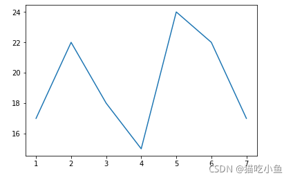
注意:plt.show()会释放figure资源,如果在显示图像之后保存图片将只能保存空图片
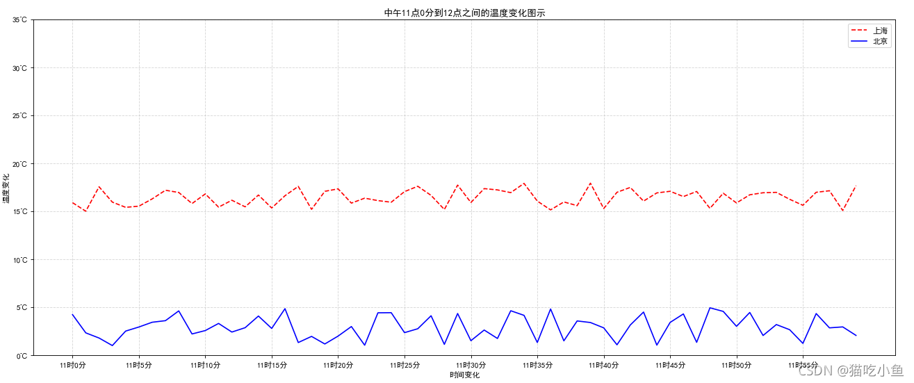
双折线图
#需求:画出某城市11点到12点1小时内每分钟的温度变化折线图,温度范围在15度-18度
import matplotlib.pyplot as plt
import random

# 1、准备数据 x y
x = range(60)
y_shanghai = [random.uniform(15,18) for i in x]
y_beijing = [random.uniform(1,5) for i in x]
# 2、创建画布
plt.figure(figsize=(20,8),dpi=80)

# 3、绘制图像
plt.plot(x,y_shanghai,color="r",linestyle="--",label="上海")
plt.plot(x,y_beijing,color="b",label="北京")

#显示图例
plt.legend()

# 修改x、y刻度
# 准备x的刻度说明
x_label =["11时{}分".format(i) for i in x]
plt.xticks(x[::5],x_label[::5])
plt.yticks(range(0,40,5),["{}℃".format(i) for i in range(0,40,5)])
#添加显示网格
plt.grid(True,linestyle="--",alpha=0.5)
#添加描述信息
plt.xlabel("时间变化")
plt.ylabel("温度变化")
plt.title("中午11点0分到12点之间的温度变化图示")
# 4、显示图像
plt.show()
折线图-双绘图区
import matplotlib.pyplot as plt
import random

# 1、准备数据 x y
x = range(60)
y_shanghai = [random.uniform(15,18) for i in x]
y_beijing = [random.uniform(1,5) for i in x]
# 2、创建画布
# plt.figure(figsize=(20,8),dpi=80)
figure,axes=plt.subplots(nrows=1,ncols=2,figsize=(20,8),dpi=80)

# 3、绘制图像
axes[0].plot(x,y_shanghai,color="r",linestyle="--",label="上海")
axes[1].plot(x,y_beijing,color="b",label="北京")

#显示图例
axes[0].legend()
axes[1].legend()

# 修改x、y刻度
# 准备x的刻度说明
x_label =["11时{}分".format(i) for i in x]
axes[0].set_xticks(x[::10])
axes[0].set_xticklabels(x_label[::10])
axes[0].set_yticks(range(0,40,5))
axes[0].set_yticklabels(["{}℃".format(i) for i in range(0,40,5)])
axes[1].set_xticks(x[::10])
axes[1].set_xticklabels(x_label[::10])
axes[1].set_yticks(range(0,40,5))
axes[1].set_yticklabels(["{}℃".format(i) for i in range(0,40,5)])

#添加显示网格
axes[0].grid(True,linestyle="--",alpha=0.5)
axes[1].grid(True,linestyle="--",alpha=0.5)

#添加描述信息
axes[0].set_xlabel("时间变化")
axes[0].set_ylabel("温度变化")
axes[0].set_title("上海中午11点0分到12点之间的温度变化图示")
axes[1].set_xlabel("时间变化")
axes[1].set_ylabel("温度变化")
axes[1].set_title("北京中午11点0分到12点之间的温度变化图示")
# 4、显示图像
plt.show()

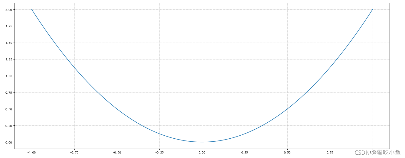
折线图-绘制数据函数
import matplotlib.pyplot as plt
import numpy as np

# 1、准备x,y数据
x=np.linspace(-1,1,1000)
y = 2 * x * x
# 2、创建画布
plt.figure(figsize=(20,8),dpi=80)
# 3、绘制图像
plt.plot(x,y)
# 4、添加网格显示
plt.grid(True,linestyle="--",alpha=0.5)
# 5、显示图像
plt.show()
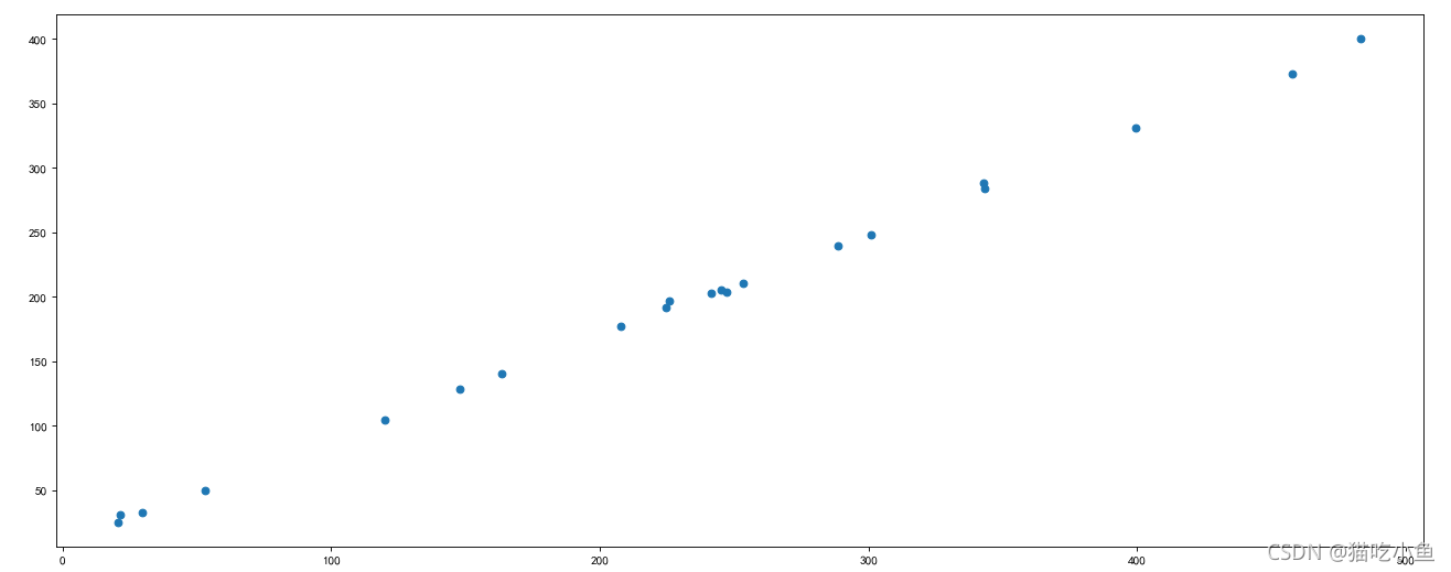
散点图 scatter
- 用两组数据构成多个坐标点,考察坐标点的分布,判断两变量之间是否存在某种关联或总结坐标点的分布模式。
- 特点:判断变量之间是否存在数量关联趋势,展示离群点(分布规律)
import matplotlib.pyplot as plt
#需求:探究房屋面积和房屋价格的关系
# 1、准备数据
x = [225.98, 247.07, 253.14, 457.85, 241.58, 301.01,  20.67, 288.64,
       163.56, 120.06, 207.83, 342.75, 147.9 ,  53.06, 224.72,  29.51,
        21.61, 483.21, 245.25, 399.25, 343.35]

y = [196.63, 203.88, 210.75, 372.74, 202.41, 247.61,  24.9 , 239.34,
       140.32, 104.15, 176.84, 288.23, 128.79,  49.64, 191.74,  33.1 ,
        30.74, 400.02, 205.35, 330.64, 283.45]
# 2、创建画布
plt.figure(figsize=(20,8),dpi=80)
# 3、绘制图像
plt.scatter(x,y)
# 4、显示图像
plt.show()
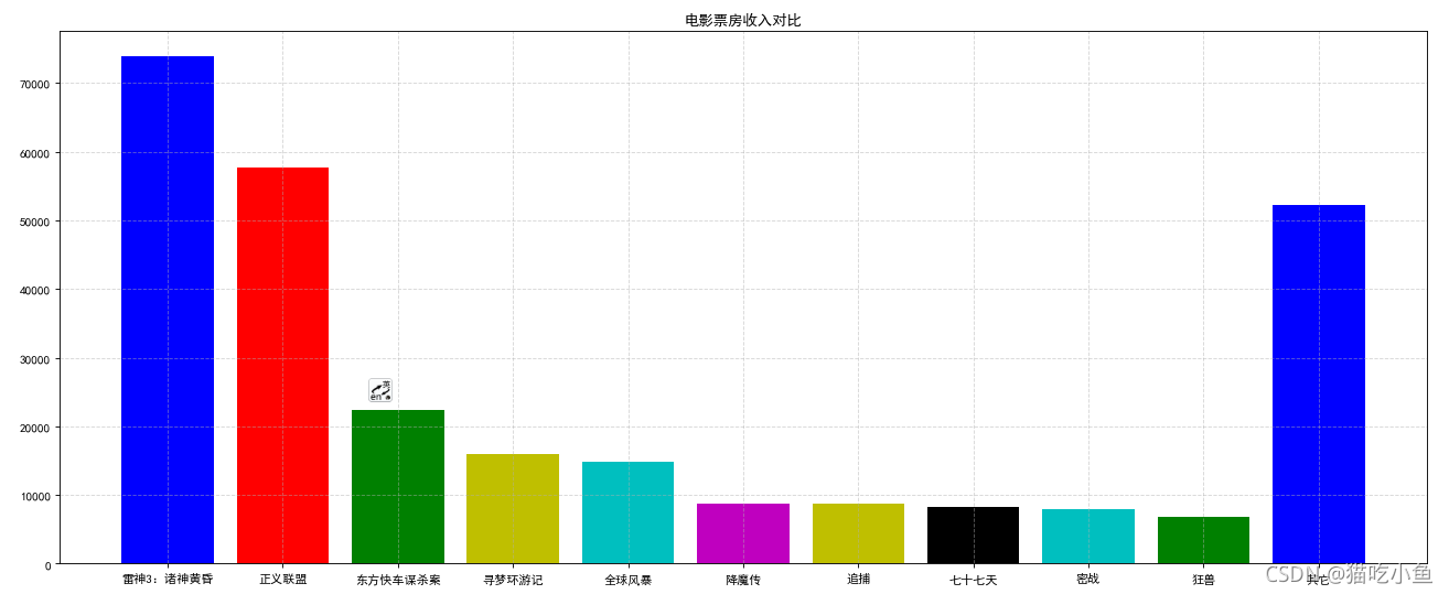
柱状图 bar
- 排列在工作表的列或行中的数据可以绘制到柱状图中。
- 特点:绘制连离散的数据,能够一眼看出名个数据的大小,比较数据之间的差别(统计/对比)
import matplotlib.pyplot as plt
import random
# 1、准备数据
movie_names = ['雷神3:诸神黄昏','正义联盟','东方快车谋杀案','寻梦环游记','全球风暴', '降魔传','追捕','七十七天','密战','狂兽','其它']
tickets = [73853,57767,22354,15969,14839,8725,8716,8318,7916,6764,52222]

# 2、创建画布
plt.figure(figsize=(20, 8), dpi=80)

# 3、绘制柱状图
x_ticks = range(len(movie_names))
plt.bar(x_ticks, tickets, color=['b','r','g','y','c','m','y','k','c','g','b'])

# 修改x刻度
plt.xticks(x_ticks, movie_names)

# 添加标题
plt.title("电影票房收入对比")

# 添加网格显示
plt.grid(linestyle="--", alpha=0.5)

# 4、显示图像
plt.show()
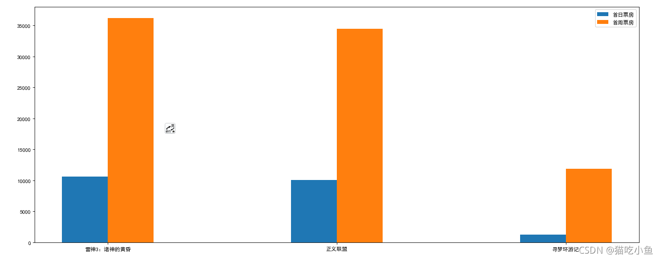
多个柱状图显示
import matplotlib.pyplot as plt
import random
# 1、准备数据
movie_name=['雷神3:诸神的黄昏','正义联盟','寻梦环游记']
first_day=[10587.6,10062.5,1275.7]
first_weekend=[36224.9,34479.6,11830]
#2、创建画布
plt.figure(figsize=(20,8),dpi=80)
#3、绘制柱状图
plt.bar(range(3),first_day,width=0.2,label="首日票房")
plt.bar([0.2,1.2,2.2],first_weekend,width=0.2,label="首周票房")

#显示图例
plt.legend()
# 显示刻度
plt.xticks([0.1,1.1,2.1],movie_name)
#4、显示图像
plt.show()
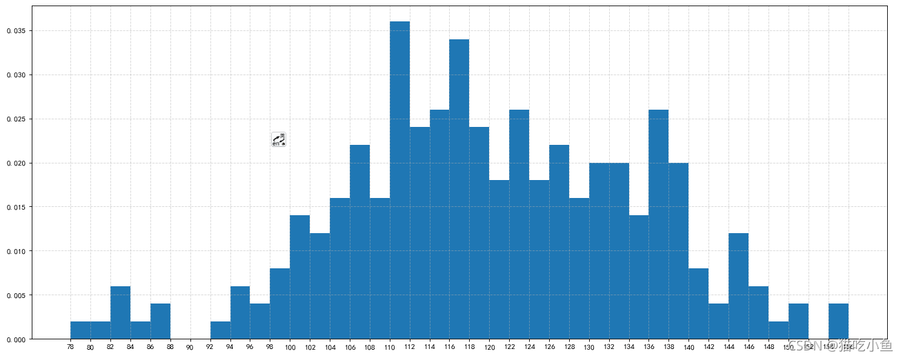
直方图 histogram
- 由一系列高度不等的纵向条纹或线段表示数据分布的情况。一般用横轴表示数据范围,纵轴表示分布情况。
- 特点:绘制连续性的数据展示一组或者多组数据的分布状况(统计)
- 直方图牵涉统计学的概念,首先要对数据进行分组,然后统计每个分组内数据元的数量。在坐标系中,横轴标出每个组的端点,纵轴表示频数,每个矩形的高代表对应的频数,称这样的统计图为频数分布直方图。
直方图与柱状图的区别
- 直方图展示数据的分布,柱状图比较数据的大小(最根本的区别)
- 直方图X轴为定量数据,柱状图X轴为分类数据
- 直方图柱子无间隔,柱状图柱子有间隔
- 直方图柱子宽度可不一,柱状图柱子宽度须一致
import matplotlib.pyplot as plt
import random
# 需求:电影时长分布状况
# 1、准备数据
time = [131,  98, 125, 131, 124, 139, 131, 117, 128, 108, 135, 138, 131, 102, 107, 114, 119, 128, 121, 142, 127, 130, 124, 101, 110, 116, 117, 110, 128, 128, 115,  99, 136, 126, 134,  95, 138, 117, 111,78, 132, 124, 113, 150, 110, 117,  86,  95, 144, 105, 126, 130,126, 130, 126, 116, 123, 106, 112, 138, 123,  86, 101,  99, 136,123, 117, 119, 105, 137, 123, 128, 125, 104, 109, 134, 125, 127,105, 120, 107, 129, 116, 108, 132, 103, 136, 118, 102, 120, 114,105, 115, 132, 145, 119, 121, 112, 139, 125, 138, 109, 132, 134,156, 106, 117, 127, 144, 139, 139, 119, 140,  83, 110, 102,123,107, 143, 115, 136, 118, 139, 123, 112, 118, 125, 109, 119, 133,112, 114, 122, 109, 106, 123, 116, 131, 127, 115, 118, 112, 135,115, 146, 137, 116, 103, 144,  83, 123, 111, 110, 111, 100, 154,136, 100, 118, 119, 133, 134, 106, 129, 126, 110, 111, 109, 141,120, 117, 106, 149, 122, 122, 110, 118, 127, 121, 114, 125, 126,114, 140, 103, 130, 141, 117, 106, 114, 121, 114, 133, 137,  92,121, 112, 146,  97, 137, 105,  98, 117, 112,  81,  97, 139, 113,134, 106, 144, 110, 137, 137, 111, 104, 117, 100, 111, 101, 110,105, 129, 137, 112, 120, 113, 133, 112,  83,  94, 146, 133, 101,131, 116, 111,  84, 137, 115, 122, 106, 144, 109, 123, 116, 111,111, 133, 150]

# 2、创建画布
plt.figure(figsize=(20, 8), dpi=80)

# 3、绘制直方图
distance = 2
group_num = int((max(time) - min(time)) / distance)

plt.hist(time, bins=group_num, density=True)

# 修改x轴刻度
plt.xticks(range(min(time), max(time) + 2, distance))

# 添加网格
plt.grid(linestyle="--", alpha=0.5)

# 4、显示图像
plt.show()
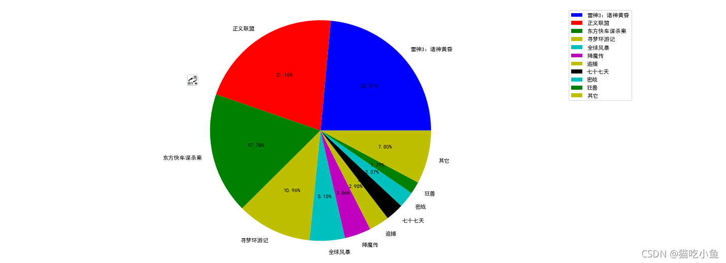
饼图 pie
- 用于表示不同分类的占比情况,通过弧度大小来对比各种分类。
- 特点:分类数据的占比情况(占比)
import matplotlib.pyplot as plt
import random
# 1、准备数据
movie_name = ['雷神3:诸神黄昏','正义联盟','东方快车谋杀案','寻梦环游记','全球风暴','降魔传','追捕','七十七天','密战','狂兽','其它']

place_count = [60605,54546,45819,28243,13270,9945,7679,6799,6101,4621,20105]

# 2、创建画布
plt.figure(figsize=(20, 8), dpi=80)

# 3、绘制饼图
plt.pie(place_count, labels=movie_name, colors=['b','r','g','y','c','m','y','k','c','g','y'], autopct="%1.2f%%")

# 显示图例
plt.legend()

plt.axis('equal')

# 4、显示图像
plt.show()
总结
– Matplotlib三层结构:
- 容器层
1.画板层Canvas
2.画布层:plt.figure(figsize=(20,8),dpi=80)
3.绘图区/坐标系
1.figure,axes=plt.subplots(nrows=,ncols=,figsize=,dpi=) - 辅助显示层:
1.修改x,y轴刻度 plt.x/yticks()
2.添加描述信息plt.x/ylabel();plt.title()
3.添加网格plt.grid()
4.显示图例plt.legend() - 图像层(可以设置图像颜色、风格、标签等)
1.折线图 plt.plot()
2.散点图 plt.scatter()
3.柱状图 plt.bar()
4.直方图 plt.hist()
5.饼图 plt.pie()

永洪科技,致力于打造全球领先的数据技术厂商,具备从数据应用方案咨询、BI、AIGC智能分析、数字孪生、数据资产、数据治理、数据实施的端到端大数据价值服务能力。
更多推荐


 0
0 0
0- 0


 已为社区贡献1条内容

所有评论(0)