低代码可视化-uniapp拖拉排序组件-代码生成器
模板自定义,支持拖动你想要的组件进排序里一个组件里,生成代码即有效。在 UniApp中实现拖拉排序功能,你可以使用一些第三方组件库或者自己手动实现。以下是一个基本的实现思路和示例代码,帮助你入门。
·
在 UniApp中实现拖拉排序功能,你可以使用一些第三方组件库或者自己手动实现。以下是一个基本的实现思路和示例代码,帮助你入门。
思路
数据准备:准备需要排序的列表数据。
渲染列表:使用 v-for 渲染列表项。
拖拽事件:为每个列表项添加拖拽事件,包括 touchstart、touchmove 和 touchend。
位置计算:计算拖拽过程中的位置,判断目标位置,并更新数据。
样式处理:添加拖拽过程中的样式变化,如透明度、阴影等。
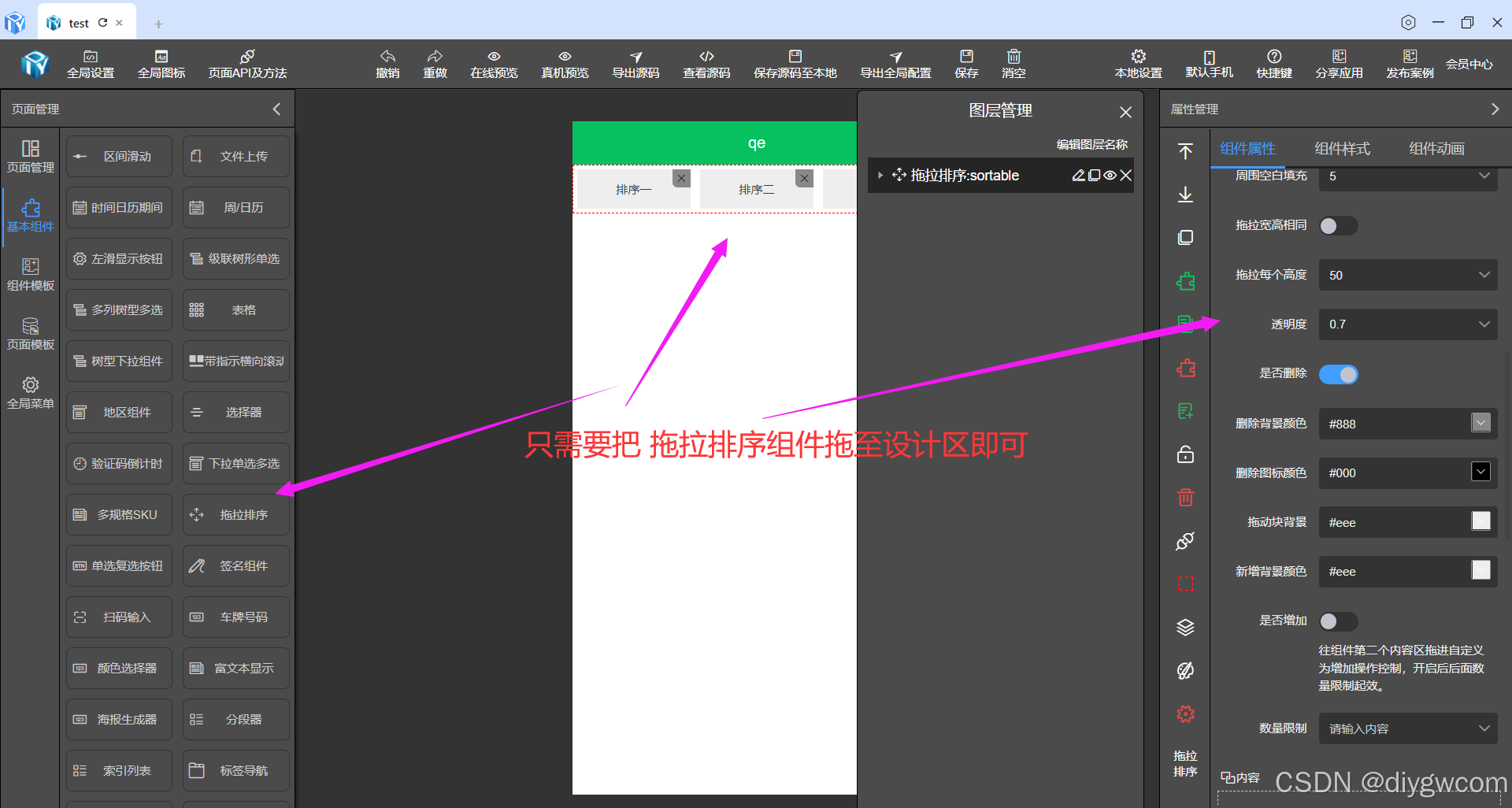
可视化拖拉
默认拖拉排序
拖拉排序组件进设计区
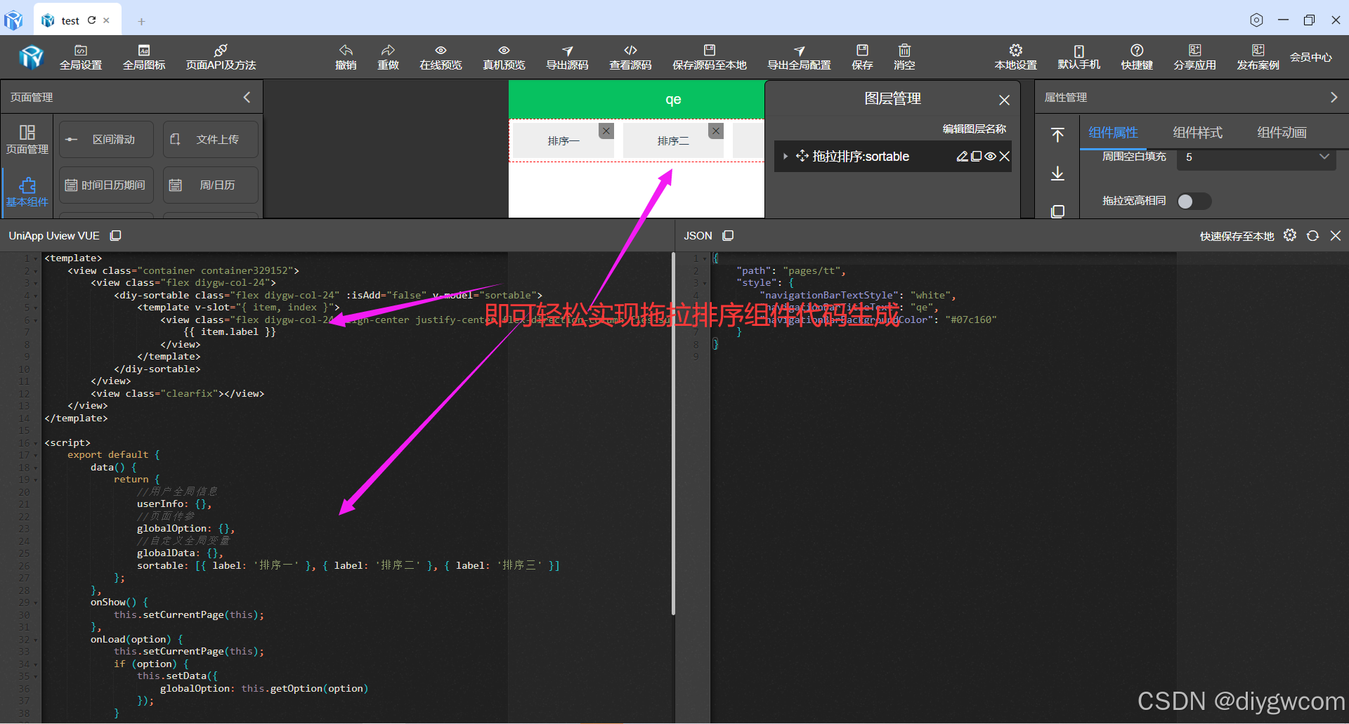
<template>
	<view class="container container329152">
		<view class="flex diygw-col-24">
			<diy-sortable class="flex diygw-col-24" :isAdd="false" v-model="sortable">
				<template v-slot="{ item, index }">
					<view class="flex diygw-col-24 align-center justify-center flex-direction-column fles-sub">
						{{ item.label }}
					</view>
				</template>
			</diy-sortable>
		</view>
		<view class="clearfix"></view>
	</view>
</template>

<script>
	export default {
		data() {
			return {
				//用户全局信息
				userInfo: {},
				//页面传参
				globalOption: {},
				//自定义全局变量
				globalData: {},
				sortable: [{ label: '排序一' }, { label: '排序二' }, { label: '排序三' }]
			};
		},
		onShow() {
			this.setCurrentPage(this);
		},
		onLoad(option) {
			this.setCurrentPage(this);
			if (option) {
				this.setData({
					globalOption: this.getOption(option)
				});
			}

			this.init();
		},
		methods: {
			async init() {}
		}
	};
</script>

<style lang="scss" scoped>
	.container329152 {
	}
</style>
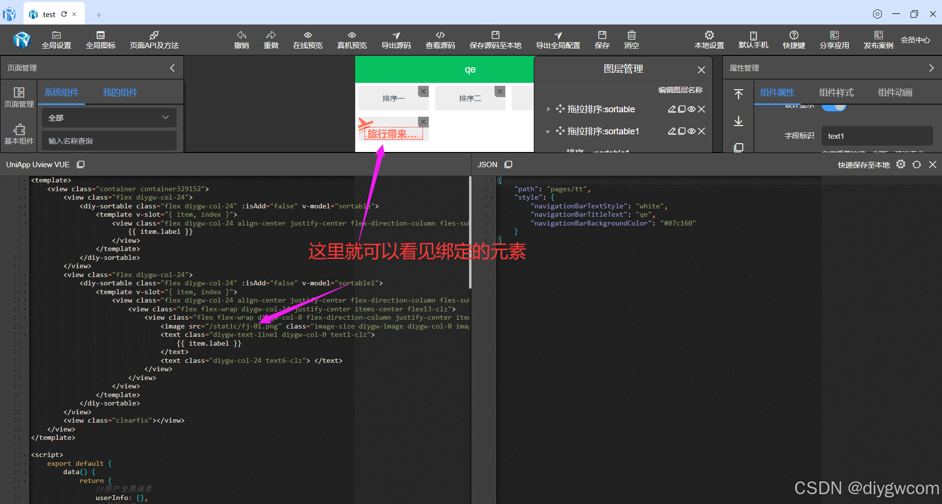
模板自定义
模板自定义,支持拖动你想要的组件进排序里一个组件里,生成代码即有效。
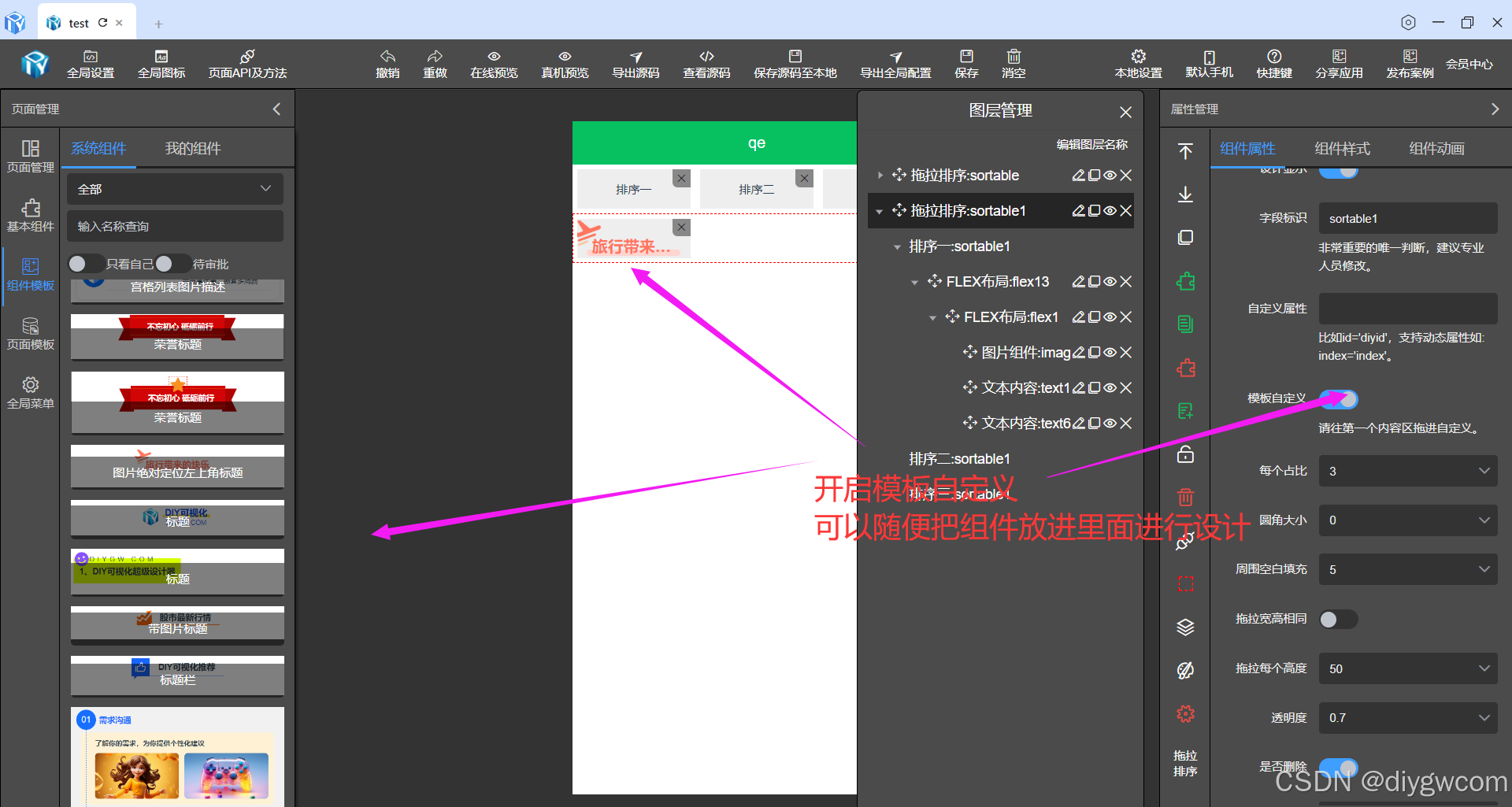
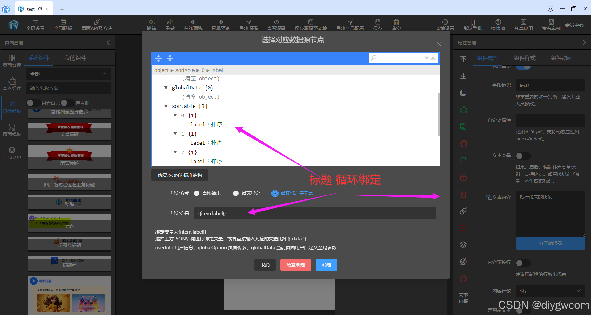
任意绑定数据
比如果我们的标题要动态绑定label,用循环绑定子元素。
<template>
<view class="container container329152">
<view class="flex diygw-col-24">
<diy-sortable class="flex diygw-col-24" :isAdd="false" v-model="sortable">
<template v-slot="{ item, index }">
<view class="flex diygw-col-24 align-center justify-center flex-direction-column fles-sub">
{{ item.label }}
</view>
</template>
</diy-sortable>
</view>
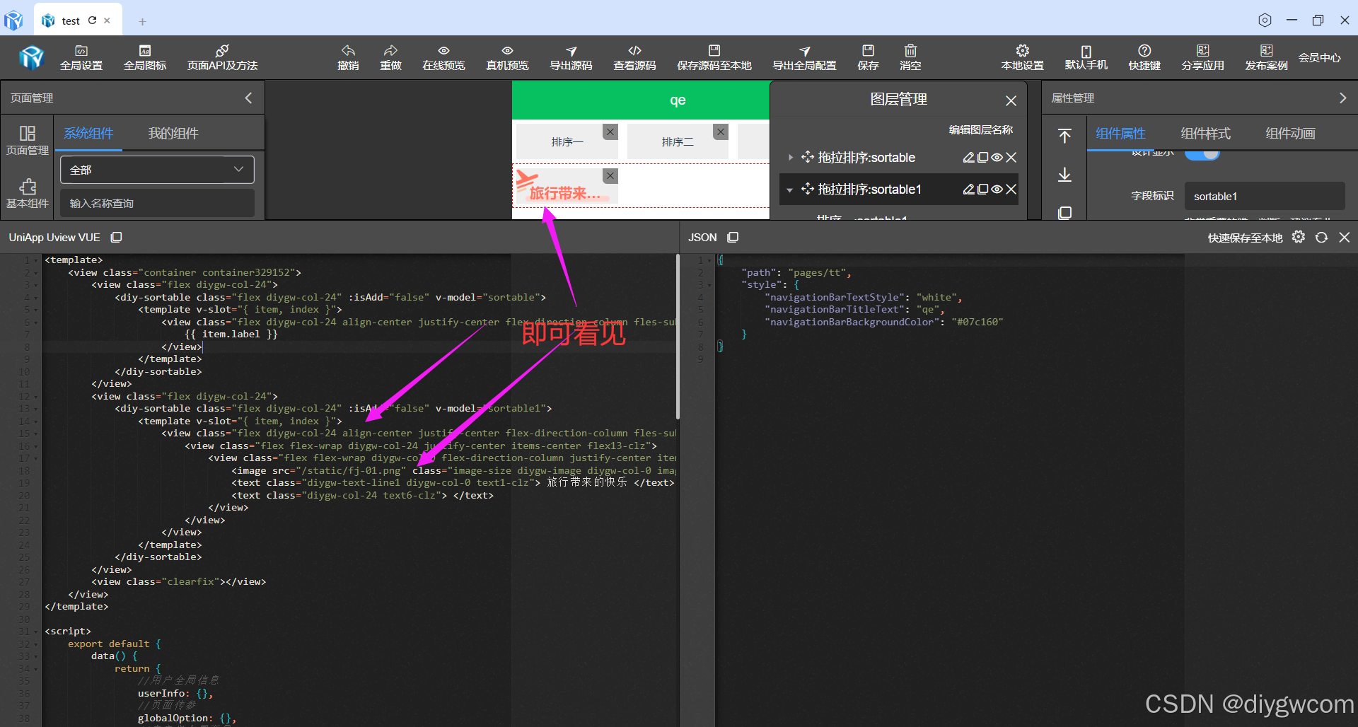
<view class="flex diygw-col-24">
<diy-sortable class="flex diygw-col-24" :isAdd="false" v-model="sortable1">
<template v-slot="{ item, index }">
<view class="flex diygw-col-24 align-center justify-center flex-direction-column fles-sub">
<view class="flex flex-wrap diygw-col-24 justify-center items-center flex13-clz">
<view class="flex flex-wrap diygw-col-0 flex-direction-column justify-center items-center flex1-clz" @tap="tabClick(index)">
<image src="/static/fj-01.png" class="image-size diygw-image diygw-col-0 image-clz" mode="widthFix"></image>
<text class="diygw-text-line1 diygw-col-0 text1-clz">
{{ item.label }}
</text>
<text class="diygw-col-24 text6-clz"> </text>
</view>
</view>
</view>
</template>
</diy-sortable>
</view>
<view class="clearfix"></view>
</view>
</template>
<script>
export default {
data() {
return {
//用户全局信息
userInfo: {},
//页面传参
globalOption: {},
//自定义全局变量
globalData: {},
sortable: [{ label: '排序一' }, { label: '排序二' }, { label: '排序三' }],
sortable1: [{ label: '排序一' }, { label: '排序二' }, { label: '排序三' }]
};
},
onShow() {
this.setCurrentPage(this);
},
onLoad(option) {
this.setCurrentPage(this);
if (option) {
this.setData({
globalOption: this.getOption(option)
});
}
this.init();
},
methods: {
async init() {}
}
};
</script>
<style lang="scss" scoped>
.flex13-clz {
padding-top: 16rpx;
padding-left: 10rpx;
padding-bottom: 0rpx;
padding-right: 10rpx;
}
.flex1-clz {
padding-top: 24rpx;
padding-left: 10rpx;
padding-bottom: 10rpx;
padding-right: 10rpx;
}
.image-clz {
top: -12rpx;
left: -20rpx;
position: absolute;
}
.image-size {
height: 60rpx !important;
width: 60rpx !important;
}
.text1-clz {
padding-top: 0rpx;
z-index: 1;
color: #fe765f;
font-weight: bold;
padding-left: 10rpx;
font-size: 32rpx !important;
padding-bottom: 0rpx;
padding-right: 10rpx;
}
.text6-clz {
border-bottom-left-radius: 40rpx;
color: #ffffff;
border-top-right-radius: 40rpx;
margin-right: 0rpx;
background-color: #ffd5cf;
margin-left: 0rpx;
flex-shrink: 0;
overflow: hidden;
width: calc(100% - 0rpx - 0rpx) !important;
border-top-left-radius: 40rpx;
margin-top: -12rpx;
border-bottom-right-radius: 40rpx;
margin-bottom: 0rpx;
height: 12rpx !important;
}
.container329152 {
}
</style>
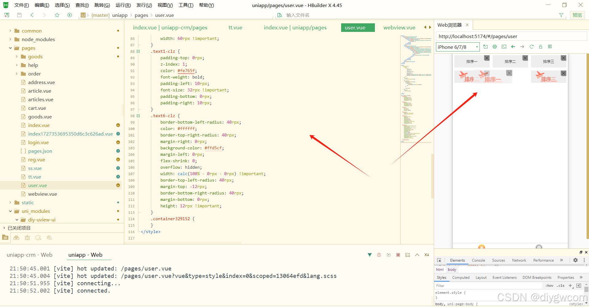
本地预览效果

永洪科技,致力于打造全球领先的数据技术厂商,具备从数据应用方案咨询、BI、AIGC智能分析、数字孪生、数据资产、数据治理、数据实施的端到端大数据价值服务能力。
更多推荐

 1
1 0
0- 0


 已为社区贡献28条内容

所有评论(0)