使用ultralytics框架训练模型后可视化结果
用ultralytics框架训练模型后会在runs/detect下生成关于训练相关的权重等文件,里面会有metrics和loss的结果图,不过他们是分开可视化,有时候需要把他们会在同一幅图上去分析和观察,那么可以从results.csv文件中选择需要的指标去可视化
·
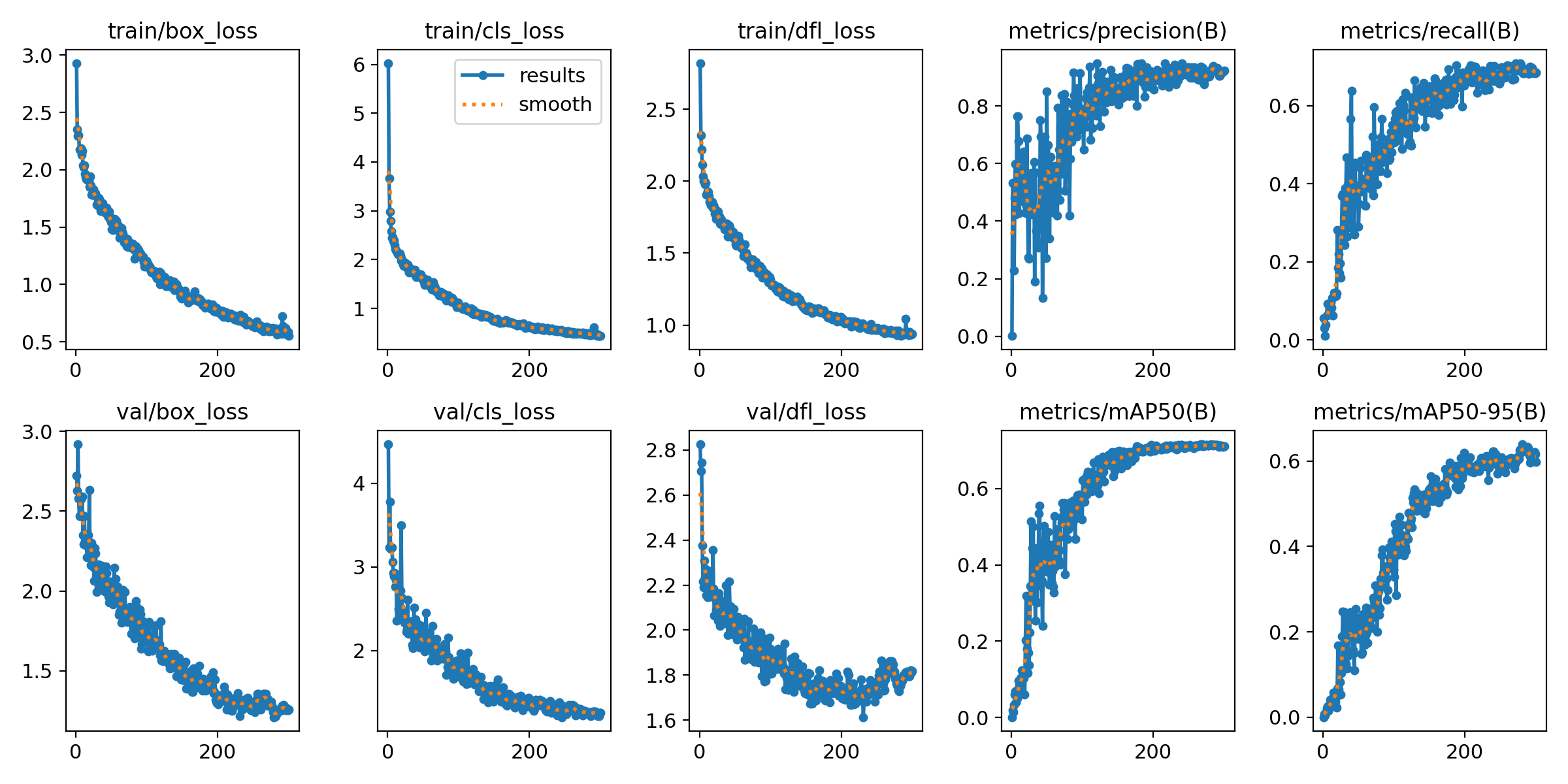
🚀使用ultralytics框架训练模型后会在runs/detect下生成关于训练相关的权重等文件,里面会有metrics和loss的结果图,不过他们是分开可视化,有时候需要把他们会在同一幅图上去分析和观察,那么可以从results.csv文件中选择需要的指标去可视化,代码如下:
import argparse
import os
import pandas as pd
import seaborn as sns
from tqdm import tqdm
import matplotlib.pyplot as plt
from matplotlib import patheffects
import matplotlib.ticker as ticker
from scipy.ndimage import gaussian_filter1d


def parse_opt(known=False):
    parser = argparse.ArgumentParser()
    parser.add_argument('--csv', type=str, default='/data_zyz/xhy/Project/ObjectDetection/ultralytics-main/runs/detect/train-roaddistress2024-12-yolo11l/results.csv', help='result csv path')
    parser.add_argument('--output_dir', type=str, default='/data_zyz/xhy/Project/ObjectDetection/ultralytics-main/runs/imgs', help='output folder to save plots')
    return parser.parse_known_args()[0] if known else parser.parse_args()


def smooth(data, sigma=2):
    return gaussian_filter1d(data, sigma=sigma)


def plot_dual_axis(epoch, perf_dict, loss_dict, labels_perf, labels_loss, filename):
    sns.set_theme(style="whitegrid")
    fig, ax1 = plt.subplots(figsize=(14, 6))
    max_epoch = int(epoch.max())

    # 设置左侧Y轴在x=0的位置
    ax1.spines['left'].set_position(('data', 0))
    ax1.spines['left'].set_color('black')
    # ax1.yaxis.set_label_coords(-0.05, 0)  # 调整标签位置

    # 隐藏右侧原始边框
    ax1.spines['right'].set_visible(False)
    ax1.spines['top'].set_visible(False)

    # 绘制性能指标
    color_map_perf = {
        'mAP': 'red',
        'Precision': 'orange',
        'Recall': 'magenta'
    }
    for label in labels_perf:
        color = color_map_perf.get(label, None)
        ax1.plot(epoch, smooth(perf_dict[label]), label=label, linestyle='-', linewidth=1.5, color=color)

    ax1.set_xlabel('Epoch', fontsize=14)
    ax1.set_ylabel('Performance', fontsize=14)
    ax1.set_ylim(0, 1.0)

    # 设置x轴刻度(包含首尾)
    xticks = sorted(list({0, max_epoch} | set(range(0, max_epoch+1, 20))))
    ax1.set_xticks(xticks)
    ax1.set_xlim(-0.5, max_epoch+0.5)  # 留出轴的位置空间

    # 创建第二个y轴并移动到最右侧
    ax2 = ax1.twinx()
    ax2.spines['right'].set_position(('data', max_epoch))
    ax2.spines['right'].set_color('black')
    ax2.spines['bottom'].set_color('black')
    # ax2.yaxis.set_label_coords(1.06, 0)  # 标签位置调整
    ax2.set_ylabel('Loss', fontsize=14)


    # 绘制损失指标
    for label, style in labels_loss.items():
        ax2.plot(epoch, smooth(loss_dict[label]),
                label=label,
                linestyle=style['ls'],
                color=style['color'],
                linewidth=1.5)

    # 设置Loss轴范围
    y_min, y_max = ax2.get_ylim()
    ax2.set_ylim(min(y_min, 0), y_max)

    # 绘制辅助线
    ax1.axvline(x=max_epoch, color='gray', linestyle=':', linewidth=1, alpha=0.7)
    ax2.axhline(y=0, color='gray', linestyle=':', linewidth=1, alpha=0.7)

    # 调整网格线
    ax1.xaxis.grid(True, linestyle='--', alpha=0.6)
    ax1.yaxis.grid(False)  # 关闭默认网格
    ax2.yaxis.grid(False)  # 关闭默认网格

    ax1.tick_params(axis='y', direction='in')
    ax2.tick_params(axis='y', direction='in')
    ax1.tick_params(axis='x', direction='in')


    # 创建自定义网格
    ax1.grid(axis='x', linestyle='--', alpha=0.6)
    ax1.grid(axis='y', which='major', linestyle='--',
            linewidth=0.5, alpha=0.6,
            path_effects=[patheffects.withStroke(linewidth=2, foreground="white")])  # 抗锯齿处理

    # 合并图例
    lines_1, labels_1 = ax1.get_legend_handles_labels()
    lines_2, labels_2 = ax2.get_legend_handles_labels()
    ax1.legend(lines_1 + lines_2, labels_1 + labels_2,
              loc='best',
              bbox_to_anchor=(1.05, 1),
              frameon=True)

    plt.title(filename.replace('.jpg', '').replace('_', ' ').title())
    plt.tight_layout()

    # 精细调整布局
    # plt.subplots_adjust(left=0.1, right=0.85, top=0.9, bottom=0.1)

    # 保存图像
    plt.savefig(os.path.join(opt.output_dir, filename), dpi=300, bbox_inches='tight')
    plt.close()


if __name__ == '__main__':
    opt = parse_opt()
    os.makedirs(opt.output_dir, exist_ok=True)

    df = pd.read_csv(opt.csv)
    df.columns = [col.strip() for col in df.columns]

    epoch = df['epoch']
    # Common computed values
    train_loss_total = df['train/box_loss'] + df['train/dfl_loss'] + df['train/cls_loss']
    val_loss_total = df['val/box_loss'] + df['val/dfl_loss'] + df['val/cls_loss']

    plot_tasks = [
    (
        epoch,
        {
            'Precision': df['metrics/precision(B)'],
            'Recall': df['metrics/recall(B)'],
            'mAP': df['metrics/mAP50(B)']
        },
        {
            'Train Loc Loss': df['train/box_loss'],
            'Val Loc Loss': df['val/box_loss'],
            'Train Obj Loss': df['train/dfl_loss'],
            'Val Obj Loss': df['val/dfl_loss'],
            'Train Cls Loss': df['train/cls_loss'],
            'Val Cls Loss': df['val/cls_loss'],
            'Train Box Loss': train_loss_total,
            'Val Box Loss': val_loss_total,
        },
        ['Precision', 'Recall', 'mAP'],
        {
            'Train Loc Loss': {'ls': '--', 'color': 'tab:purple'},
            'Val Loc Loss': {'ls': ':', 'color': 'tab:purple'},
            'Train Obj Loss': {'ls': '--', 'color': 'tab:green'},
            'Val Obj Loss': {'ls': ':', 'color': 'tab:green'},
            'Train Cls Loss': {'ls': '--', 'color': 'tab:cyan'},
            'Val Cls Loss': {'ls': ':', 'color': 'tab:cyan'},
            'Train Box Loss': {'ls': '--', 'color': 'tab:blue'},
            'Val Box Loss': {'ls': ':', 'color': 'tab:blue'}
        },
        'box_training.jpg'
    )
]

for task in tqdm(plot_tasks, desc='✨ Generating plots'):
    plot_dual_axis(*task)
python visualization_result/plot_training_curves.py --csv runs/detect/train-roaddistress2024-12-yolo11l/results.csv --output_dir runs/imgs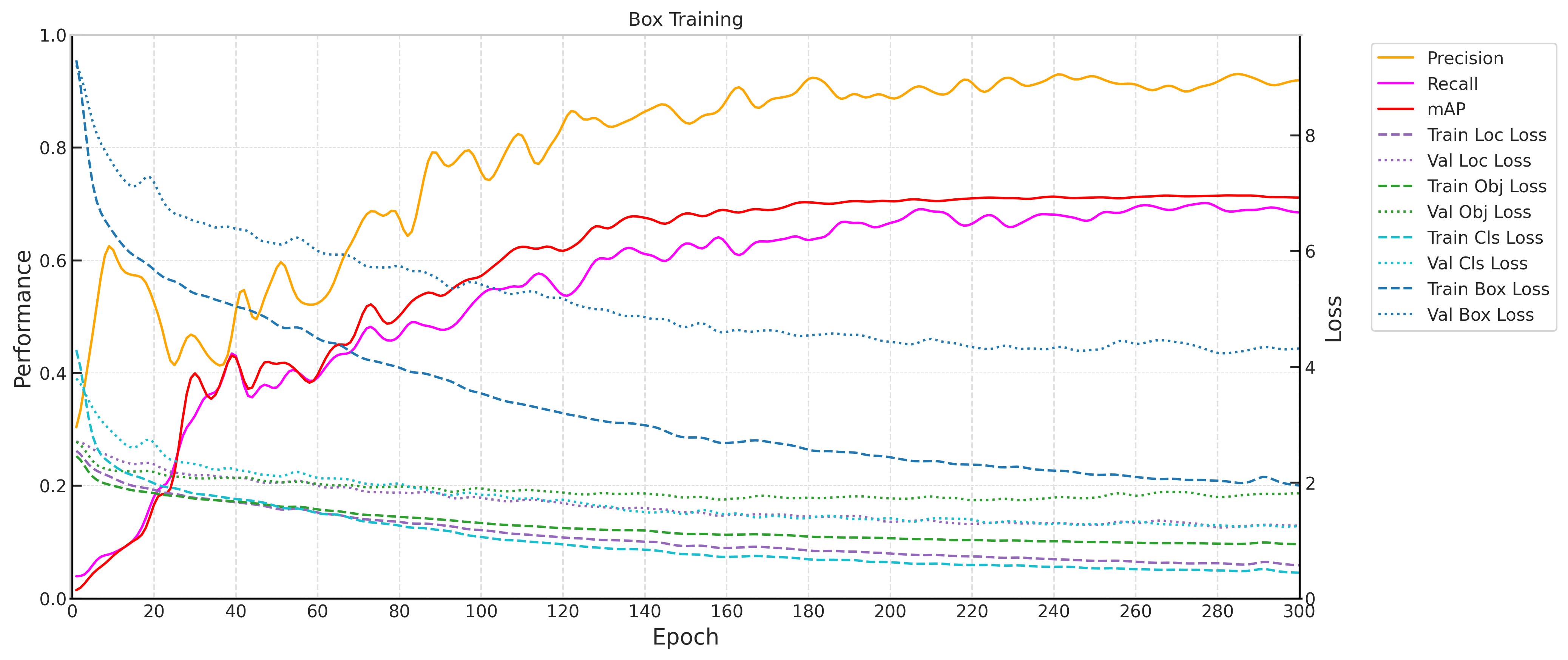

永洪科技,致力于打造全球领先的数据技术厂商,具备从数据应用方案咨询、BI、AIGC智能分析、数字孪生、数据资产、数据治理、数据实施的端到端大数据价值服务能力。
更多推荐


 1
1 0
0- 0


 已为社区贡献2条内容

所有评论(0)