Windows下,Python中使用maiplotlib库数据可视化时,如何设置中文标题
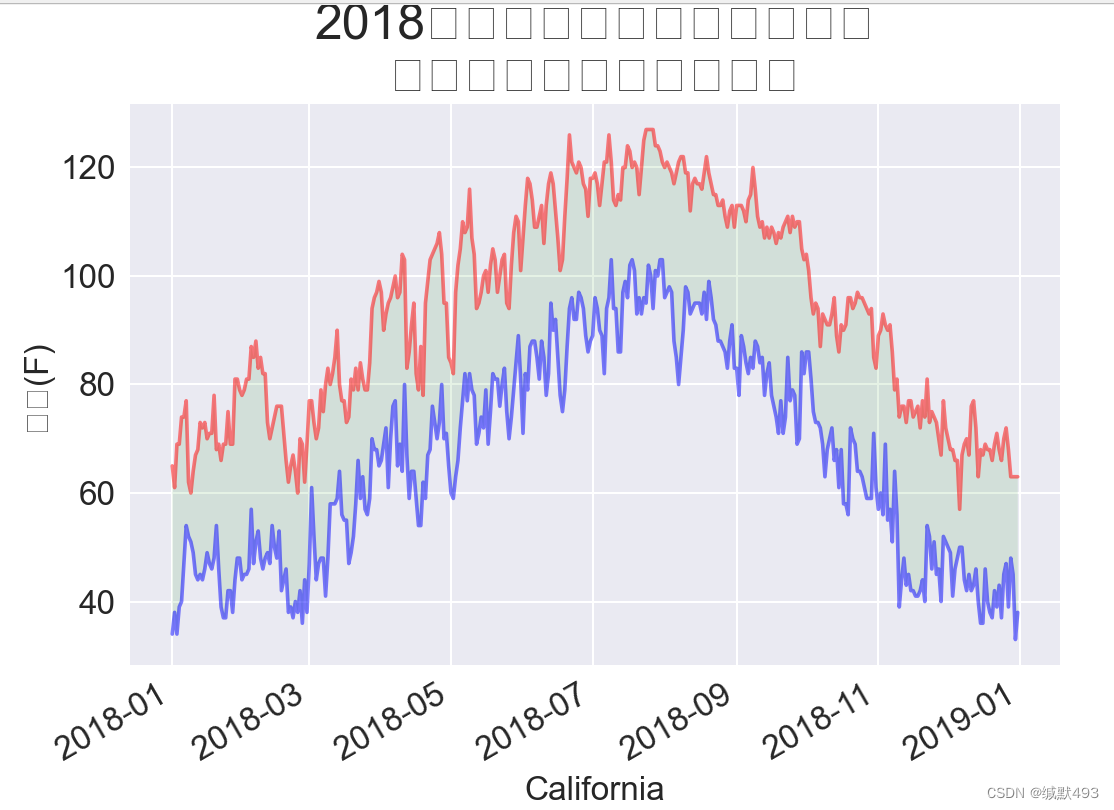
我们在使用Python进行数据可视化时,常常会出现这种标题无法显示中文的情况,这里画了一个图但是可以显示英文,无法显示中文。from datetime import datetime这个是自己编写的模块,你可以不写,或者写其他的。将 filename 参数替换为你选择的文件的路径不是csv文件的话可以不用打入.csv文件。参数替换为你选择的中文字体文件的路径,以及根据需要设置字体的大小。这几个地方
我们在使用Python进行数据可视化时,常常会出现这种标题无法显示中文的情况,这里画了一个图但是可以显示英文,无法显示中文。
显示图像标题的代码如下所示:
title = "2018年每日最高温度和最低温度\n美国加利福尼亚州死亡谷"
ax.set_title(title, fontsize=24)
ax.set_xlabel('sitka', fontsize=16)
fig.autofmt_xdate()

ax.set_ylabel('温度(F)', fontsize=16)
ax.tick_params(axis='both', which='major', labelsize=16)
plt.show()tick_params为一个用于设置坐标轴刻度参数的函数。它属于matplotlib库的Axes对象的方法之一。以下为一些有关参数:
axis:指定要设置的坐标轴,可以是'x', 'y', 'both'。分别表示x轴、y轴或者两个轴同时设置。length:刻度线的长度。width:刻度线的宽度。color:刻度线的颜色。pad:刻度标签与轴之间的间距。labelsize:刻度标签的大小。labelcolor:刻度标签的颜色。which:指定要设置样式的刻度线类型,包括'major'(主要刻度线)、'minor'(次要刻度线)或'both'。direction:指定刻度线的方向,可以是'in'(朝内)、'out'(朝外)或'both'。
更改字体的方法,找到系统字体路径:
Windows一般为:C:\Windows\Fonts
这里我们选择微软雅黑,当然你也可以选择其他的字体。
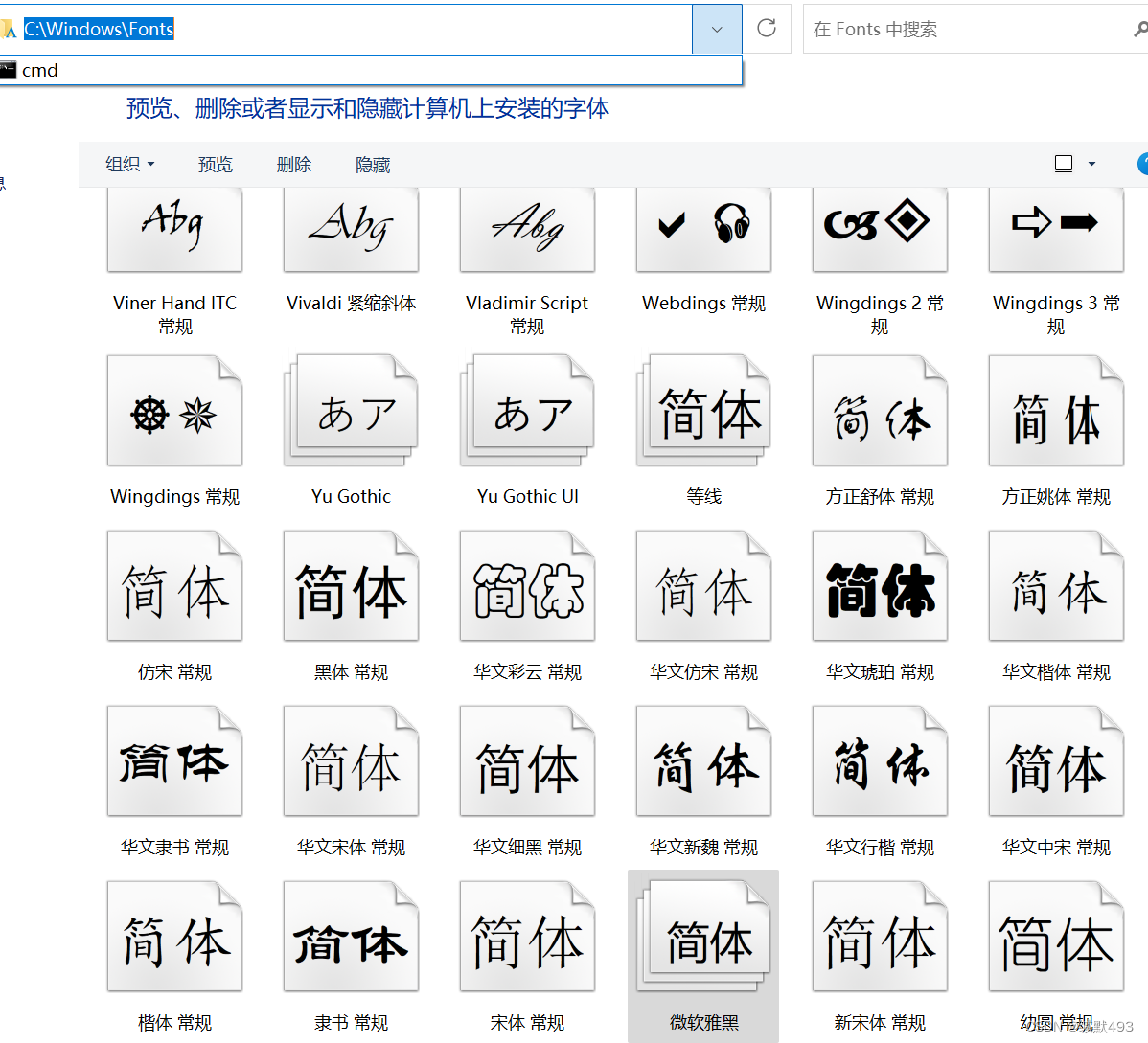
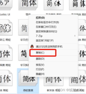
点击复制————>到python文件当前目录。
也可以使用绝对路径的方法,最好把你要使用的字体复制到一个单独的文件夹中,这个文件夹可以是新建文件夹。
常用的三种字体:
微软雅黑————>msyh.ttc
宋体————>simsun.ttc
新罗马字体————>TIMES.TTF

将 fname 参数替换为你选择的中文字体文件的路径,以及根据需要设置字体的大小。
这几个地方要注意,参数size需要你自己设置字体的大小。
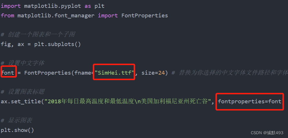
import matplotlib.pyplot as plt
from matplotlib.font_manager import FontProperties

# 创建一个图表和一个子图
fig, ax = plt.subplots()

# 设置中文字体
font = FontProperties(fname="SimHei.ttf", size=24) # 替换为你选择的中文字体文件路径和字体大小

# 设置图表标题
ax.set_title("2018年每日最高温度和最低温度\n美国加利福尼亚州死亡谷", fontproperties=font)

# 显示图表
plt.show()
以下是全文代码:
注意:因为没有贴数据,你要自己找些数据文件试着读取一下,并处理。
将 filename 参数替换为你选择的文件的路径 不是csv文件的话可以不用打入.csv文件
from datetime import datetime 这个是自己编写的模块,你可以不写,或者写其他的。
import matplotlib.pyplot as plt
from matplotlib.font_manager import FontProperties
from datetime import datetime
import csv

# 读取文件(将 filename 参数替换为你选择的文件的路径)
filename = 'data/death_valley_2018_simple.csv'

# 读取文件的第一行
with open(filename) as f:
    reader = csv.reader(f)
    header_row = next(reader)
# 打印了第一行的信息
    for index, column_header in enumerate(header_row):
        print(index, column_header)

# 演示确实数据


font = FontProperties(fname='msyh.ttc', size=20) # 替换为你选择的中文字体文件路径和字体大小
font_1 = FontProperties(fname='msyh.ttc', size=16) # 替换为你选择的中文字体文件路径和字体大小


with open(filename) as f:
    reader = csv.reader(f)
    header_row = next(reader)

    dates, highs, lows = [], [], []
    for row in reader:
        current_date = datetime.strptime(row[2], '%Y-%m-%d')
        try:
            high = int(row[4])
            low = int(row[5])
        except ValueError:
            print(f"Missing data for {current_date}")
        else:
            dates.append(current_date)
            highs.append(high)
            lows.append(low)

plt.style.use('seaborn')

fig, ax = plt.subplots()

ax.plot(dates, highs,  c='red', alpha=0.5)
ax.plot(dates, lows,  c='blue', alpha=0.5)
ax.fill_between(dates, highs, lows, facecolors='green', alpha=0.1)
# 设置图形的格式
title = "2018年每日最高温度和最低温度\n美国加利福尼亚州死亡谷"


ax.set_title(title, fontproperties=font)
ax.set_xlabel('时间', fontproperties=font_1)
fig.autofmt_xdate()

ax.set_ylabel('温度(F)', fontproperties=font_1)
ax.tick_params(axis='both', which='major', labelsize=16)
plt.show() 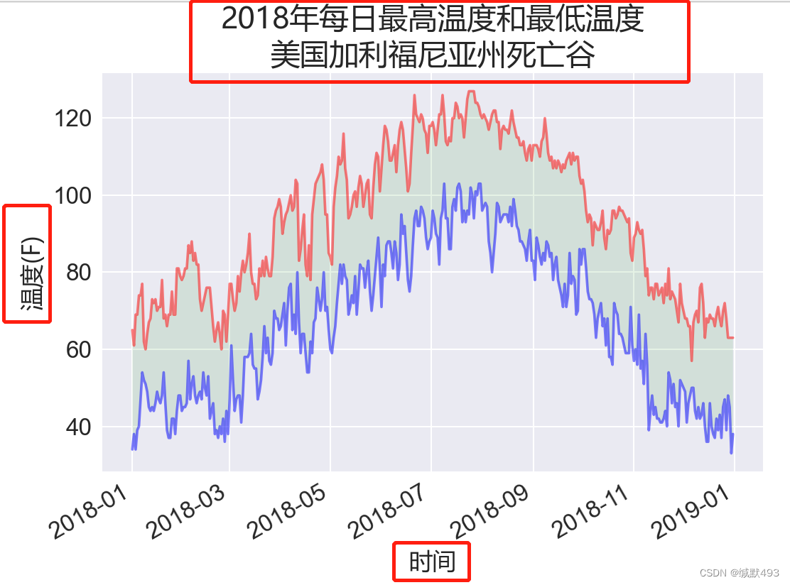
注意!!
主要是这几个模块的东西。
# 导入模块
import matplotlib.pyplot as plt
from matplotlib.font_manager import FontProperties


# 替换字体
font = FontProperties(fname='msyh.ttc', size=20) # 替换为你选择的中文字体文件路径和字体大小
font_1 = FontProperties(fname='msyh.ttc', size=16) # 替换为你选择的中文字体文件路径和字体大小

# 打印字体
title = "2018年每日最高温度和最低温度\n美国加利福尼亚州死亡谷"
ax.set_title(title, fontproperties=font)
ax.set_xlabel('时间', fontproperties=font_1)
fig.autofmt_xdate()

ax.set_ylabel('温度(F)', fontproperties=font_1)
ax.tick_params(axis='both', which='major', labelsize=16)
plt.show()
永洪科技,致力于打造全球领先的数据技术厂商,具备从数据应用方案咨询、BI、AIGC智能分析、数字孪生、数据资产、数据治理、数据实施的端到端大数据价值服务能力。
更多推荐

 1
1 0
0- 0


 已为社区贡献1条内容

所有评论(0)