数据可视化——pyecharts
数据可视化——pyecharts
·
from pyecharts.charts import Bar
from pyecharts import options as opts
# 创建 Bar 类的对象 , 并指定画布的大小
bar = Bar(init_opts=opts.InitOpts(width='600px', height='300px'))
# 添加 x 轴和 y 轴的数据
bar.add_xaxis([" 衬衫 ", " 羊毛衫 ", " 雪纺衫 ", " 裤子 ", " 高跟鞋 ", " 袜子 "])
bar.add_yaxis(" 商家 A", [5, 20, 36, 10, 75, 90])
# 设置标题、 y 轴标签
bar.set_global_opts(title_opts=opts.TitleOpts(title=" 柱形图示例 "),
                    yaxis_opts=opts.AxisOpts(name=" 销售额 ( 万元 )",
                    name_location="center", name_gap=30))
bar.render_notebook()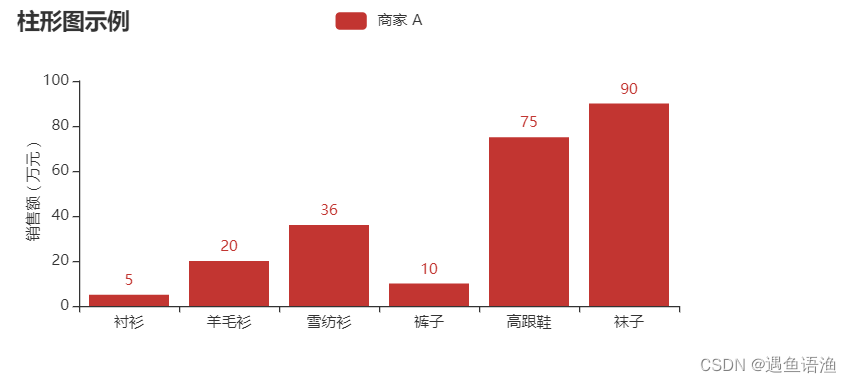
from pyecharts.charts import Bar
from pyecharts import options as opts
bar = (
    Bar(init_opts=opts.InitOpts(width='600px', height='300px'))
    .add_xaxis([" 衬衫 ", " 羊毛衫 ", " 雪纺衫 ", " 裤子 ", " 高跟鞋 ", " 袜子 "])
    .add_yaxis(" 商家 A", [5, 20, 36, 10, 75, 90])
    .set_global_opts(title_opts=opts.TitleOpts(title=" 柱形图示例 "),
                        yaxis_opts=opts.AxisOpts(name=" 销售额 ( 万元 )",
                        name_location="center", name_gap=30))
)
bar.render_notebook() 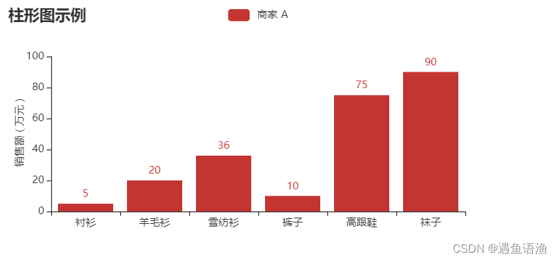

import pyecharts.options as opts
from pyecharts.charts import Line
line_demo = (
    Line()
    # 添加 x 轴、 y 轴的数据、 系列名称
    .add_xaxis([' 可乐 ', ' 雪碧 ', ' 啤酒 ', ' 橙汁 ', ' 奶茶 '])
    .add_yaxis(' 商家 A', [102, 132, 105, 52, 90],
                symbol='diamond', symbol_size=15)
     .add_yaxis(' 商家 B', [86, 108, 128, 66, 136],
                symbol='triangle', symbol_size=15)
     # 设置标题、 y 轴标签
     .set_global_opts(title_opts=opts.TitleOpts(title=" 折线图示例 "),
                       yaxis_opts=opts.AxisOpts(name=" 销售额 ( 万元 )",
                      name_location="center", name_gap=30))
)
line_demo.render_notebook() 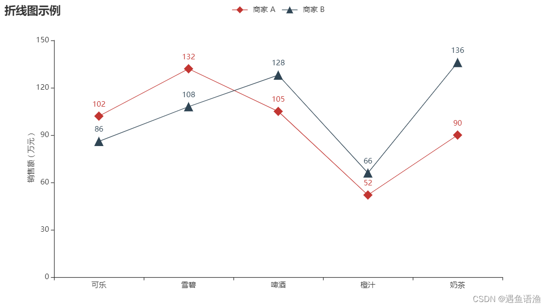
import pyecharts.options as opts
from pyecharts.charts import Pie
pie_demo = (
     Pie()
     .add("", [(' 小米 ', 150), (' 三星 ', 20), (' 华为 ', 120), (' 苹果 ', 120),
    (' 魅族 ', 117), ('vivo', 145), ('OPPO', 128)])
     .set_global_opts(title_opts=opts.TitleOpts(title=" 饼图示例 "))
)
pie_demo.render_notebook()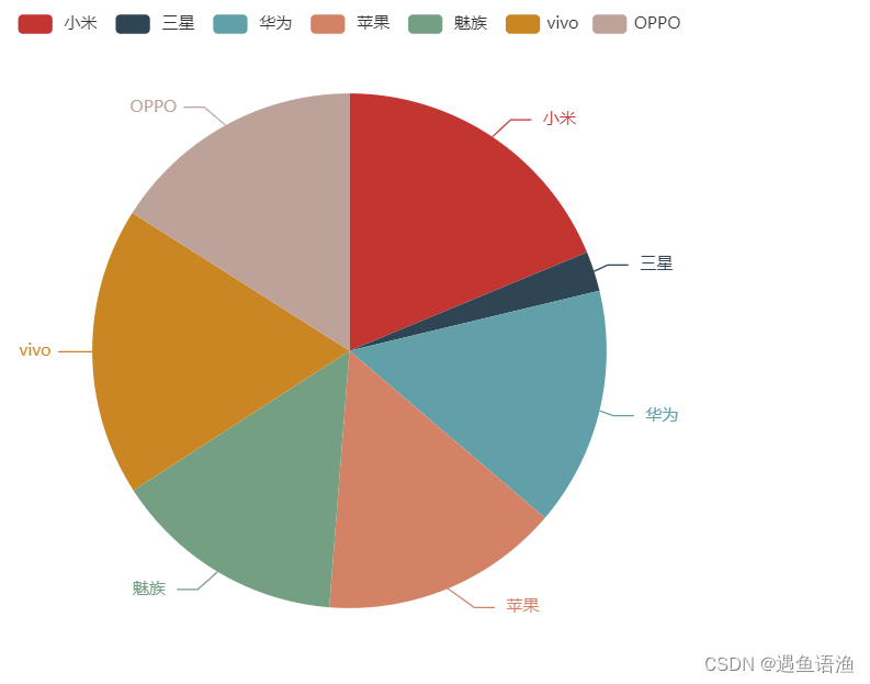
import pyecharts.options as opts
from pyecharts.charts import Pie
pie_demo = (
    Pie()
    # 添加数据
    .add("", [(' 小米 ', 150), (' 三星 ', 20), (' 华为 ', 120),
              (' 苹果 ', 120), (' 魅族 ', 117), ('vivo', 145),
              ('OPPO', 128)], center=["50%", "50%"], radius=[100, 160])
     # 设置标题
     .set_global_opts(title_opts=opts.TitleOpts(title=" 圆环图示例 "))
)
pie_demo.render_notebook() 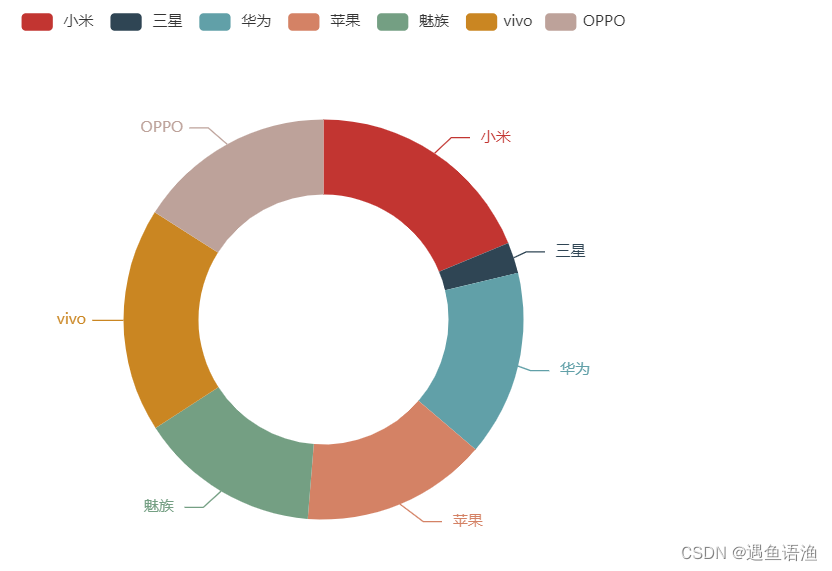
import pyecharts.options as opts
from pyecharts.charts import Scatter
scatter_demo = (
     Scatter()
     .add_xaxis([' 周一 ', ' 周二 ', ' 周三 ', ' 周四 ', ' 周五 ', ' 周六 ', ' 周日 '])
     .add_yaxis("", [30, 108, 73, 116, 73, 143, 106])
     # 设置标题、 x 轴网格、 y 轴网格和标签
     .set_global_opts(title_opts=opts.TitleOpts(title=" 散点图示例 "),
            xaxis_opts=opts.AxisOpts(splitline_opts=
              opts.SplitLineOpts(is_show=True)),
            yaxis_opts=opts.AxisOpts(splitline_opts=
              opts.SplitLineOpts(is_show=True), name=" 用户活跃量 ( 人 )",
                   name_location="center", name_gap=30)
     ) )
scatter_demo.render_notebook() 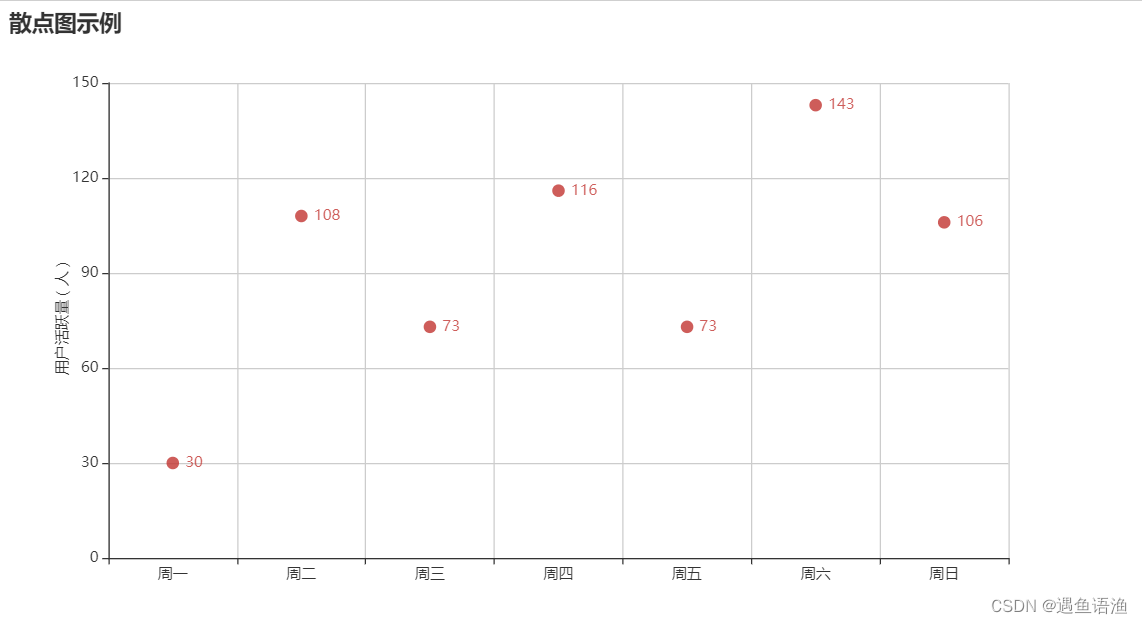
import pyecharts.options as opts
from pyecharts.charts import EffectScatter
effect_scatter = (
     EffectScatter()
     .add_xaxis([' 周一 ', ' 周二 ', ' 周三 ', ' 周四 ', ' 周五 ', ' 周六 ', ' 周日 '])
     .add_yaxis("", [30, 108, 73, 116, 73, 143, 106], symbol='pin')
     # 设置标题、 x 轴网格、 y 轴网格和标签
     .set_global_opts(title_opts=opts.TitleOpts(title=" 涟漪特效散点图示例 "),
        xaxis_opts=opts.AxisOpts(splitline_opts=
              opts.SplitLineOpts(is_show=True)),
        yaxis_opts=opts.AxisOpts(splitline_opts=
              opts.SplitLineOpts(is_show=True), name=" 用户活跃量 ( 人 )",
              name_location="center", name_gap=30)
     ) )
effect_scatter.render_notebook() 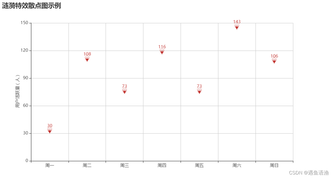
import random
from pyecharts import options as opts
from pyecharts.charts import Bar3D
data = [(i, j, random.randint(0, 20)) for i in range(7) for j in range(5)]
bar_3d = (
     Bar3D()
     .add("", [[d[1], d[0], d[2]] for d in data],
        xaxis3d_opts=opts.Axis3DOpts(['A 组 ', 'B 组 ', 'C 组 ','D 组 ', 'E 组 '],
           type_="category", name=""),
        yaxis3d_opts=opts.Axis3DOpts([' 周一 ', ' 周二 ', ' 周三 ',' 周四 ',
           ' 周五 ', ' 周六 ', ' 周日 '], type_="category", name=""),
           zaxis3d_opts=opts.Axis3DOpts(type_="value", name=" 销售额 ( 万元 )")
     )
     .set_global_opts(
        visualmap_opts=opts.VisualMapOpts(max_=30),
        title_opts=opts.TitleOpts(title="3D 柱形图示例 ")
     ) )
bar_3d.render_notebook() 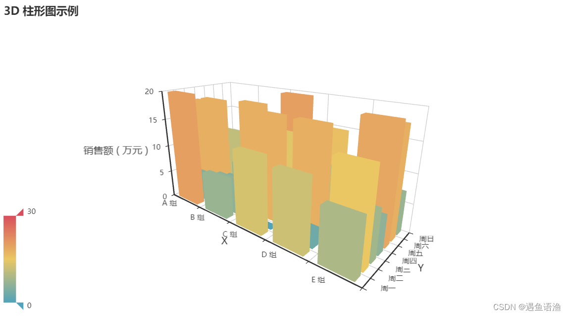
from pyecharts import options as opts
from pyecharts.charts import Funnel
data_fun = [[' 访问商品 ', 100], [' 加购物车 ', 50], [' 生成订单 ', 30],
              [' 支付订单 ', 20], [' 完成交易 ', 15]]
# 创建 Funnel 对象
funnel_demo = (
     Funnel()
     .add("", data_fun, sort_='descending',
        tooltip_opts=opts.TooltipOpts(trigger="item",
        formatter="{a} <br/>{b} : {c}%"))
     .set_global_opts(title_opts=opts.TitleOpts(title=" 漏斗图示例 "))
)
funnel_demo.render_notebook() 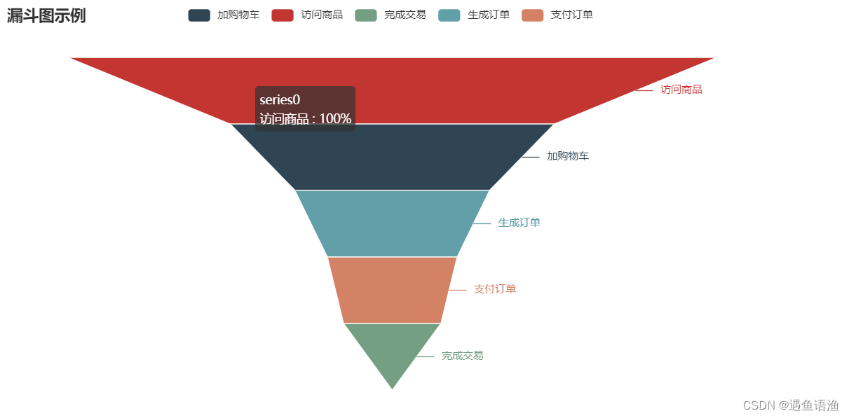
from pyecharts import options as opts
from pyecharts.charts import Bar, Line, Grid
x_data = [' 小米 ', ' 三星 ', ' 华为 ', ' 苹果 ', ' 魅族 ', 'vivo', 'OPPO']
y_a = [107, 36, 102, 91, 51, 113, 45]
y_b = [104, 60, 33, 138, 105, 111, 91]
bar = (
    Bar()
    .add_xaxis(x_data)
    .add_yaxis(" 商家 A", y_a)
    .add_yaxis(" 商家 B", y_b)
    .set_global_opts(title_opts=opts.TitleOpts(title=" 组合图表 - 柱形图 "),
                       yaxis_opts=opts.AxisOpts(name=" 销售额 ( 万元 )",
                       name_location="center", name_gap=30))
)
line = (
     Line()
     .add_xaxis(x_data)
     .add_yaxis(" 商家 A", y_a)
     .add_yaxis(" 商家 B", y_b)
     .set_global_opts(
        title_opts=opts.TitleOpts(title=" 组合图表 - 折线图 ", pos_top="48%"),
        legend_opts=opts.LegendOpts(pos_top="48%"),
        yaxis_opts=opts.AxisOpts(name=" 销售额 ( 万元 )", name_location="center",
        name_gap=30)
     ) )
# 创建组合图表 , 并以上下布局的方式显示柱形图和折线图
grid = (
     Grid()
     .add(bar, grid_opts=opts.GridOpts(pos_bottom="60%"))
     .add(line, grid_opts=opts.GridOpts(pos_top="60%"))
)
grid.render_notebook() 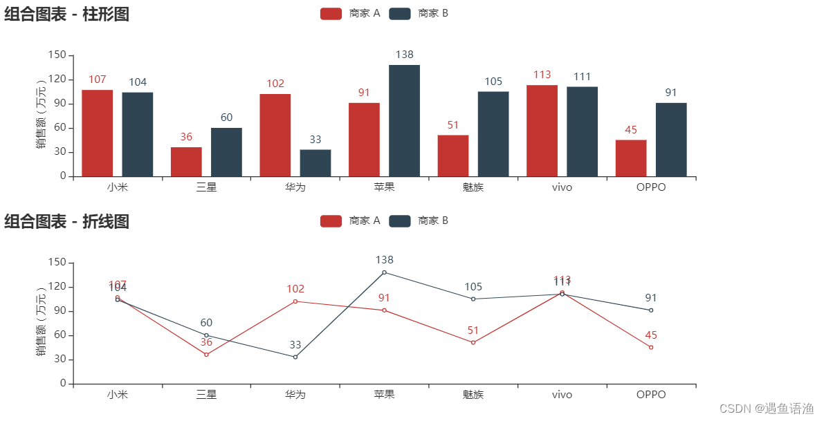
from pyecharts import options as opts
from pyecharts.charts import Bar, Line, Page
x_data = [' 小米 ', ' 三星 ', ' 华为 ', ' 苹果 ', ' 魅族 ', 'vivo', 'OPPO']
y_a = [107, 36, 102, 91, 51, 113, 45]
y_b = [104, 60, 33, 138, 105, 111, 91]
bar = (
     Bar()
    .add_xaxis(x_data)
     .add_yaxis(" 商家 A", y_a)
     .add_yaxis(" 商家 B", y_b)
     .set_global_opts(title_opts=opts.TitleOpts(title=" 组合图表 - 柱形图 "),
                       yaxis_opts=opts.AxisOpts(name=" 销售额 ( 万元 )",
                      name_location="center", name_gap=30))
)
line = (
     Line()
     .add_xaxis(x_data)
     .add_yaxis(" 商家 A", y_a)
     .add_yaxis(" 商家 B", y_b)
     .set_global_opts(title_opts=opts.TitleOpts(title=" 组合图表 - 折线图 "),
                       yaxis_opts=opts.AxisOpts(name=" 销售额 ( 万元 )",
                        name_location="center", name_gap=30))
)
# 创建组合图表 , 并在同一网页上按顺序显示柱形图和折线图
page = Page()
page.add(bar, line)
page.render_notebook()
# 导入 pyecharts 的测试数据
from pyecharts.faker import Faker
from pyecharts import options as opts
from pyecharts.charts import Bar, Page, Pie, Timeline
# 随机获取一组测试数据
x = Faker.choose()
tl = Timeline()
for i in range(2015, 2020):
     bar = (
       Bar()
       .add_xaxis(x)
        # Faker.values() 生成一个包含 7 个随机整数的列表
        .add_yaxis(" 商家 A", Faker.values())
        .add_yaxis(" 商家 B", Faker.values())
        .set_global_opts(title_opts=opts.TitleOpts(" 时间线轮播柱形图示例 "),
                            yaxis_opts=opts.AxisOpts(name=" 销售额 ( 万元 )",
                            name_location="center", name_gap=30))
     )
     tl.add(bar, "{} 年 ".format(i))
tl.render_notebook() 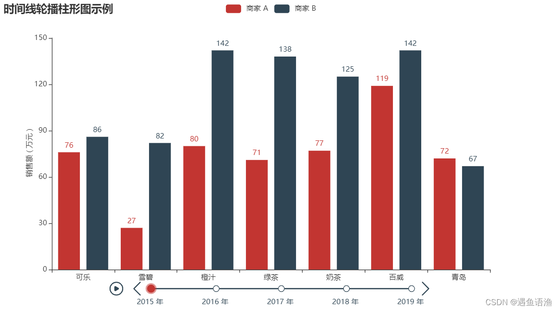

永洪科技,致力于打造全球领先的数据技术厂商,具备从数据应用方案咨询、BI、AIGC智能分析、数字孪生、数据资产、数据治理、数据实施的端到端大数据价值服务能力。
更多推荐


 1
1 0
0- 0


 已为社区贡献1条内容

所有评论(0)